 Good design doesn’t always require super creative genius. Armed with a basic understanding of typography, you, the non-designer can create well-designed, professional looking business documents that can carry your brand image to the next level. Note here though that great design, however, does require a certain level of genius and professionals like us should be hired for the really complicated stuff.
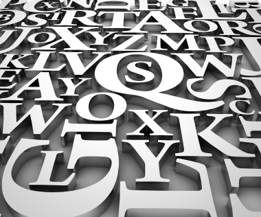
Typography involves the selection of appropriate typefaces and their arrangement on the page. Bad typography practices can negatively affect the reader’s view of your company. Good ones should be invisible, placing the focus on the content of the document and not the totally cool typeface you chose.
It is a good idea to create some company standards and make sure that everyone follows them for all documents created for in-house use and especially for external usage. This will allow your audience to concentrate on your message instead of being distracted by the layout of the document. Below are some terms you should understand and some tips to follow.
Click here to skip straight to TIPS
Measure: The standard length of a line of type is called the measure. For ideal readability, the length of a line should be 2-3 alphabets (52-78 characters including spaces) long. If a line is too long the reader loses their place when starting a new line and often gets frustrated. If the measure is too short the it is very distracting and the message can get lost. A short measure can be OK if there is only a small amount of type.
Tracking: Also known as letter spacing, tracking can completely change the readability of the entire page. A more airy feel is created by slightly expanding the tracking across a body of text. In a title or headline that is all caps it can look elegant to extend the tracking a bit. Negative tracking throughout a document is a NO-NO. Negative tracking should only be used to adjust one or two lines of justified type. As designers, we carefully use tracking to keep hyphenated words to a minimum. This is the practice of working line by line adjusting the spacing little by little to create visually appealing layouts. The reader’s eye should flow through the copy without noticing the typeface, size or spacing.
Leading: This is a term that has been around since the days of hand-set metal type and it refers to the distance between the lines of type (also known as line spacing). Leading should never be less that the actual point size of the type. If you have created a wide measure (see above) then it is a good idea to increase the leading a bit to allow the reader’s eyes to easily find the next line. If you are reversing type out (making white type on a black background, for instance) then you should increase the leading and tracking. Because of the high contrast the letter forms need to be further apart, lighter in weight and have more space between the lines. You should also use a thinner font, by the way, in this case.
Hierarchy: A typographic hierarchy expresses an organizational system for content, emphasizing some information and diminishing others. A hierarchy helps readers scan text, knowing where to enter and exit and how to pick and choose among its offerings. Each level of the hierarchy should be signaled by one or more cues, applied consistently across a body of text. A cue can be an indent for a new section, or a change in type face color, size or style.
Typeface vs. Font: In this day and age where everyone uses computers the terms have become interchangeable but they actually mean very different things. The typeface is the original design of a style of type family. A font is a variation of a typeface like bold, italic or a particular size (9 pt., 10 pt., 12, pt. etc). I read a great distinction on The Font Feed where they compare typefaces to songs and fonts to MP3’s. You would not say, “I like that MP3,” in the same way you would not say, “I like the design of that font.” The font is the thing you actually use on the computer as a way of delivering a visual representation of the typeface. While we are on the subject of typefaces…
Typeface Selection: Skilled graphic designers choose typefaces based on their knowledge of history, awareness of trends and an understanding of the audience. We are constantly aware of the use of type around us all day long on signage, packaging, television, magazines. We instinctively know which typefaces represent fun, stability, elegance or action. When it comes to setting type for a business document you want to choose a typeface with a high degree of readability that disappears to the reader as their eyes take in the meaning of the words. Good choices are Helvetica, Garamond, Frutiger and Futura.
- Ideally in Word documents, you should set the left margin at 1.25″ or 1.5, while the right should be at least 1″ for easy legibility if you are using 10-12pt type.
- Do not double space after a period. If you learned, as I did, to type in the prehistoric typewriter era then you are probably guilty of this type crime. When they invented the word processing software we all use today they built in certain spacing functions such as the perfect “space and a half” after periods as a signal to our brains to rest before continuing on to the next sentence. So stop doing it manually because it creates an unsightly (to us graphic designers) triple space and large visual gaps that create “rivers” throughout your document. Typographic rivers are a subject I will save for another blog.
- When creating marginal notes or captions try using Flush Right on those sections to add visual interest.
- BOLD, ITALIC, AND UNDERLINED CAPS should be used in moderation for emphasis. Never use all three in the same document. You only need one to get your point across.
- Use 10-11pt type for documents that have a lot of copy (type). 9pt is often too small for some typefaces and people over 35 like me. 12pt can look clunky and elementary on an 8.5 x 11 piece of paper.
- When you need a bold or italic font if at all possible use the pull down menu to choose the particular font (Helvetica Bold, Garamond Bold, Arial Bold, etc) instead of the toolbar icons provided in applications such as Microsoft Word. This may seem ridiculous to you but your eye does understand the subtle differences. Typeface designers carefully create each character in the entire type family (bold, regular, thin, italic, bold italic, etc) to ensure proper legibility of each letter and numeral to enhance the readability. The bold tool bar command will often just make the font thicker regardless of the thicks and thins inherent in the typeface and decrease overall legibility.
- Using all caps in a headline can convey formality or power. But be careful not to make the headline too long or people will have a hard time reading it. Our eyes are trained to recognize word shapes in lower case so we tend to skip over long lengths of all cap type. A headline is supposed to stand out and be easy to read, not ignored.
- Script fonts indicate formality and should be used sparingly for invitations, awards and other short important documents. Do not type an entire document in a script typeface. Also, never type anything in a script font in all caps unless you don’t want people to read it.
- To create a clean professional document stick to fonts in the same family. Avoid pairing fonts that are only slightly different like two sans serif fonts (Univers Bold and Helvetica Regular) or two serif fonts like Garamond and Times New Roman. It is OK to make your titles in one typeface and your body copy in another as long as they are visually very different. It is always safe to use fonts within the same family (Bold, Italic, Thin). This is what they are designed for.
- Don’t try to be edgy or cool by choosing a funky font for large amounts of copy. If you feel the urge to choose a crazy typeface to be different, again, use it sparingly. These typestyles can be draining on the eye if used for entire paragraphs at a time. The reader will become frustrated and likely lose interest in the information presented. So if you are trying to create a fun document go ahead and make the title in a crazy typeface and then set the rest in a more casual sans serif face like Helvetica, Gill Sans, Futura or Univers.
- Don’t justify your type if you have more than one paragraph. The application you are using to create your document will stretch and squish at random to force the words and spaces to fit. Designers spend many hours of tedious work to typeset justified text that is truly well-proportioned and legible. A ragged-right composition will give the text a more harmonious appearance and make it easier to read.
- When creating lists use bullets instead of hyphens or asterisks. Use Control+Shift+L on a PC and Option+8 on a Mac.
Look for more tips to come in future blogs and remember that all these seemingly small details can have a large effect on the professionalism of the overall document.
And to think, I’ve spent countless hours trying to gather all this information, when you’ve laid it all out here for me! Great stuff! Keep it coming!
Oh please, please, write about typographic rivers! I cannot convince my coworkers to single space after a period (after any punctuation).
Oh, the essay we could write on rivers! I will try to punch this one out in the next couple of weeks. Thanks for reading, Deb.